
No products in the cart.
Choosing Colors That Women Love in Your Hair Care Branding
Why do certain hair care brands instantly attract female customers while others get overlooked? Color psychology in hair care branding speaks to emotions before logic even enters the conversation.
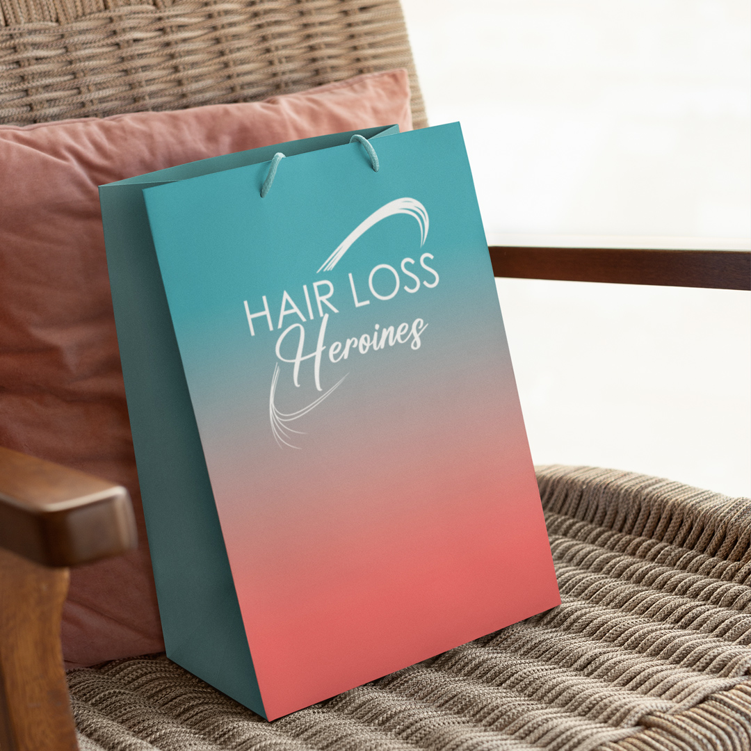
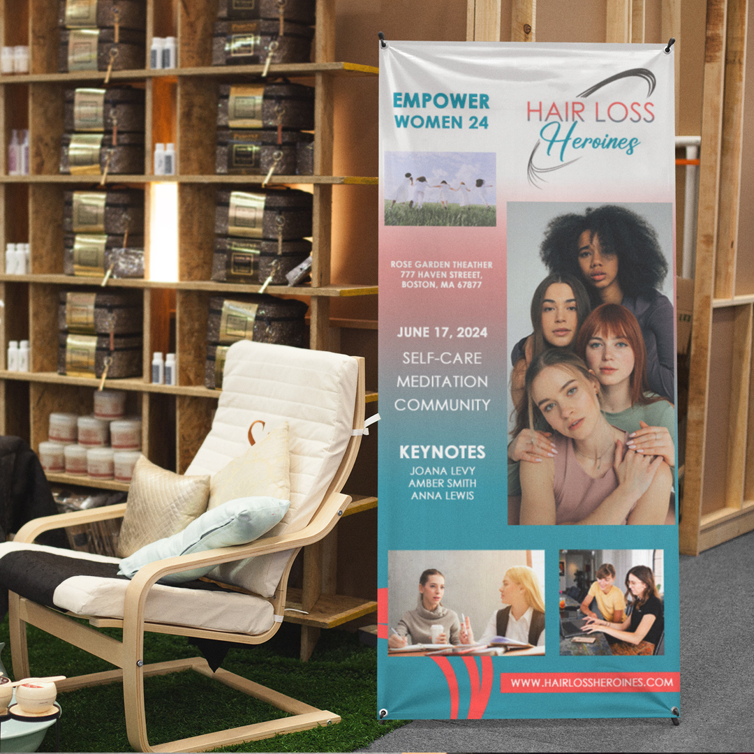
Women process color differently than men—they see more variations and attach deeper meaning to hues. The teal and coral palette for Hair Loss Heroines wasn't arbitrary. Teal provides emotional stability during vulnerable moments, while coral adds optimistic energy without overwhelming.
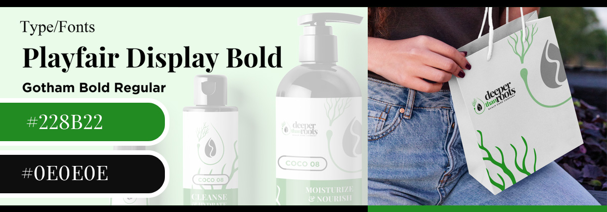
Green remains the universal winner for natural hair products marketing. It triggers associations with health, growth, and eco-consciousness. But the specific shade matters tremendously.
Forest green feels medicinal and serious, while sage green whispers gentle botanical care.
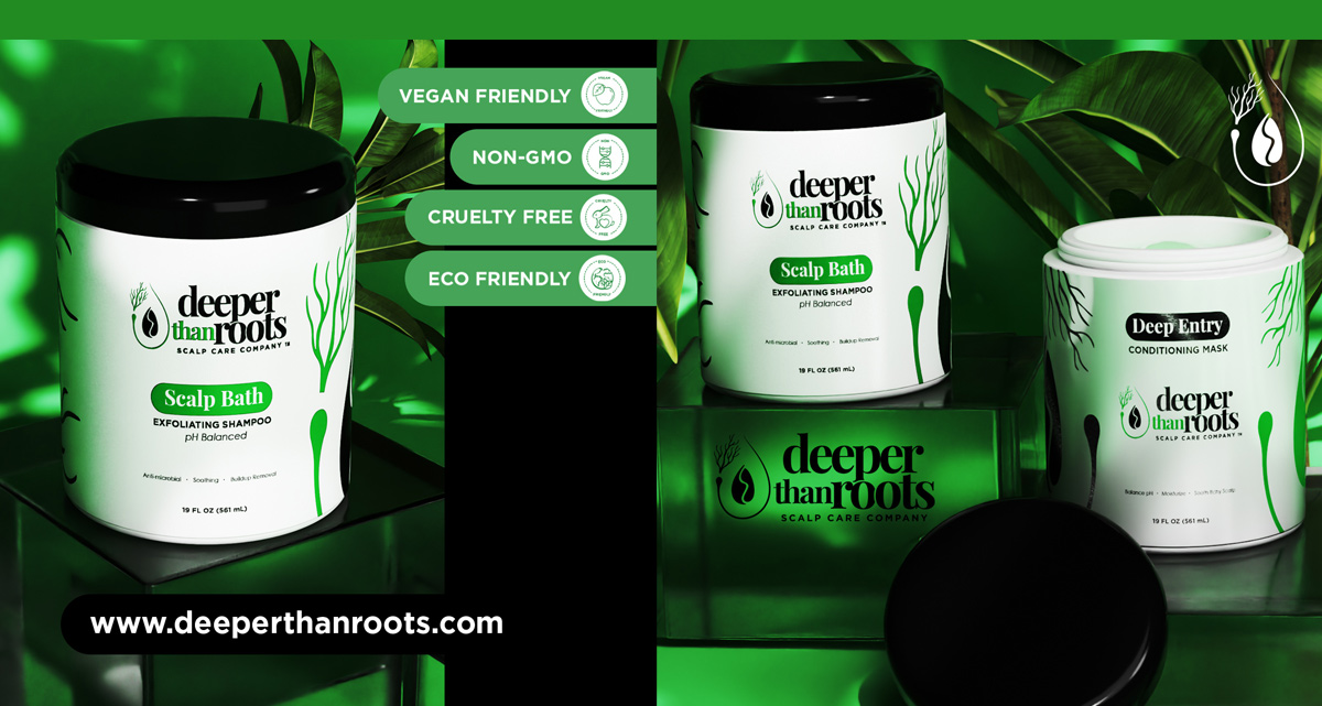
Black in hair packaging design adds instant sophistication. When we paired it with green for Deeper Than Roots, it elevated the brand from "natural" to "premium natural."
This combination particularly appeals to professional women seeking effective solutions without compromising elegance.
Gradients create emotional journeys on packaging. The teal-to-coral transition on Hair Loss Heroines products mirrors the transformation customers hope to experience—from struggle to confidence. Your hair care packaging should visualize the promise.
Metallics strategically placed add luxury without overdoing costs.
A gold foil accent on your hair care logo can justify premium pricing in customers' minds. Women often buy hair products as self-care investments, and colors should honor that.
Consider cultural color associations for global markets. While white means purity in Western markets, it symbolizes mourning in some Asian cultures. Smart hair advertising adapts without losing brand identity.
Pinterest users love unexpected color combinations that feel fresh yet timeless. Mint and blush, navy and copper—these pairings make products feel special enough to gift.