
No products in the cart.
Stand Out in a Crowded Market with Bold Hair Care Branding
When shelves overflow with similar-looking bottles, how does your hair care branding command attention? Through bold choices that others are too afraid to make.
Standing out doesn't mean shouting—it means speaking differently. While competitors focused on hair results, Deeper Than Roots talked about scalp health. This unique angle in hair products marketing carved out distinctive space in an $87.9 billion market.
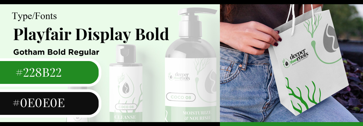
Bold doesn't always mean bright. The sophisticated black and green palette we chose stood out precisely because it wasn't trying to scream for attention.
Sometimes the boldest hair packaging design choice is elegant restraint.
Your brand story should challenge industry norms. Hair Loss Heroines didn't hide behind euphemisms—they put "hair loss" directly in their name. This honest approach in hairstylist branding attracted customers tired of products dancing around their real concerns.
Typography can be your boldest statement. The combination of Playfair Display Bold with Gotham Bold Regular created unexpected sophistication. When everyone uses safe sans-serifs, a thoughtful serif choice in hair care logo design demands attention.
Bold brands take clear positions.
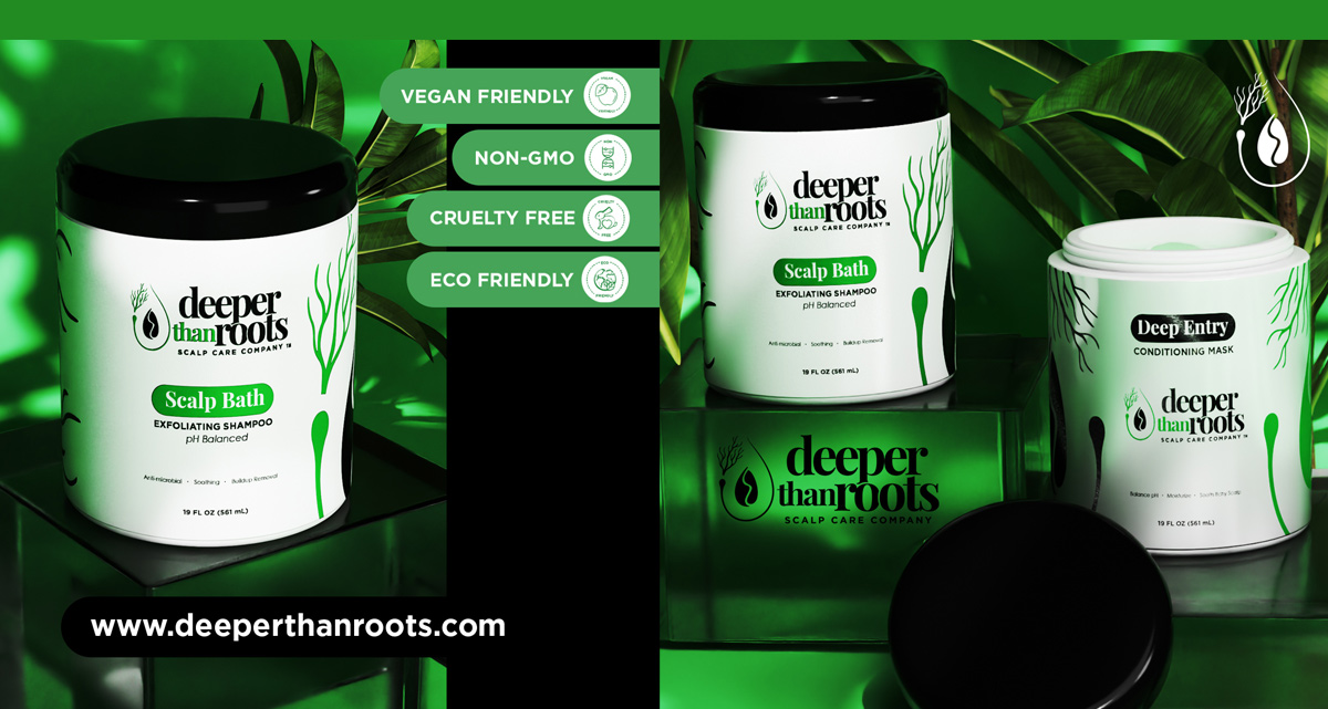
Deeper Than Roots' environmental stance wasn't subtle—eco-friendly badges dominated packaging. In hair advertising that tries to please everyone, specific values attract devoted customers.
Consider unexpected touchpoints for differentiation. Custom tissue paper, branded hair ties included with purchases, handwritten thank-you cards—these bold service choices create memorable experiences beyond hair graphic design.
Standing out means being discoverable differently. While others fight for "best shampoo" rankings, own specific niches like "scalp care for sensitive skin" where competition is lighter but customers are desperate for solutions.