
No products in the cart.
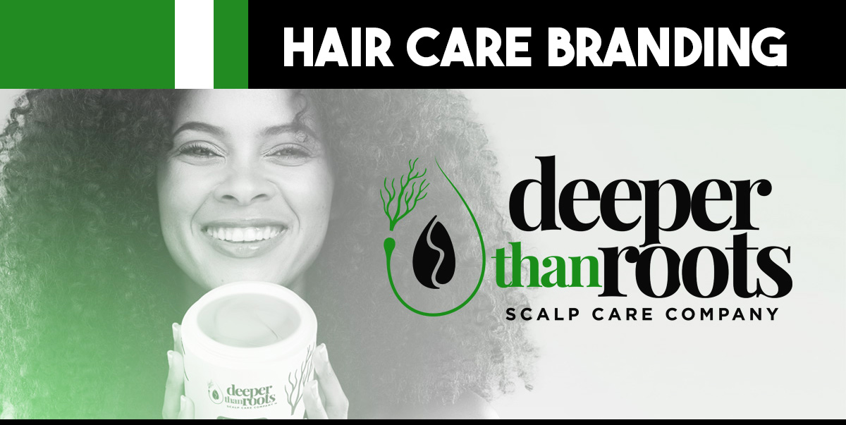
Logo Design That Builds Instant Trust in Hair Care Branding
What makes customers trust a hair care brand they've never tried? A professionally designed logo that communicates competence and care within milliseconds of viewing.
Your hair care logo is often the first and last thing customers remember about your brand. That's why the Deeper Than Roots logo combined natural elements with bold typography—it needed to convey both gentleness and strength simultaneously.
Creating trust through hairstylist branding requires understanding psychology. Rounded shapes feel friendly and approachable, while sharp angles suggest precision and professionalism. We balanced both in the leaf design, making it feel scientifically backed yet naturally sourced.
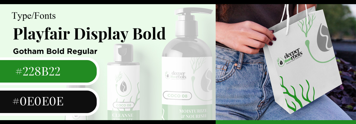
Color consistency across touchpoints reinforces reliability. When customers see the same green shade on your website, packaging, and promotional materials, their brain interprets this consistency as dependability.
This subconscious trust-building through hair products design is incredibly powerful.
Typography weight matters more than most realize. Bold fonts suggest confidence and established expertise. The Playfair Display Bold choice for Deeper Than Roots wasn't random—it commanded respect while remaining readable at any size.
Professional logos avoid trendy elements that quickly date them.
While competitors chase Instagram aesthetics, timeless hair graphic design builds long-term trust. The clean lines we used will look as professional in ten years as they do today.
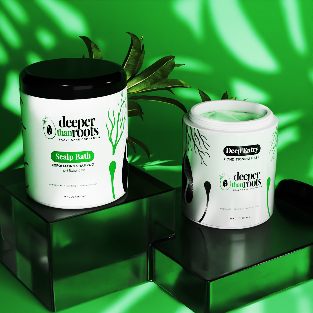
Scalability tests trust—literally. Logos that break down when shrunk for business cards or blown up for billboards create doubt about attention to detail. Every hair care packaging element should maintain clarity at any size.
White space around logos isn't wasted space—it's breathing room that suggests confidence. Crowded designs scream desperation, while thoughtful spacing whispers established success.