
No products in the cart.
How Skincare Branding Appeals to Health-Conscious Women
Health-conscious women aren't just buying skincare—they're investing in their wellbeing. So why does your branding matter more to them than anyone else?
I've designed brands for everything from clinical formulations to honey-infused natural lines, and here's what I know: health-conscious consumers like most judge products on packaging as well.
They study your packaging before they read your ingredient list. Your branding either earns their trust instantly or sends them scrolling past.
Why Health-Conscious Women Demand Smarter Skincare Branding
Let's get real about this market segment. Health-conscious women research everything. They know ingredients, understand pH levels, and can spot greenwashing from across the room.
Your branding is their first credibility test.
Before they flip your product over to scan ingredients, they're reading visual cues. Does your color palette suggest synthetic chemicals or natural botanicals? Does your typography feel clinical and trustworthy or cheap and mass-produced?
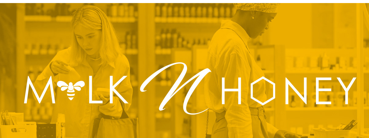
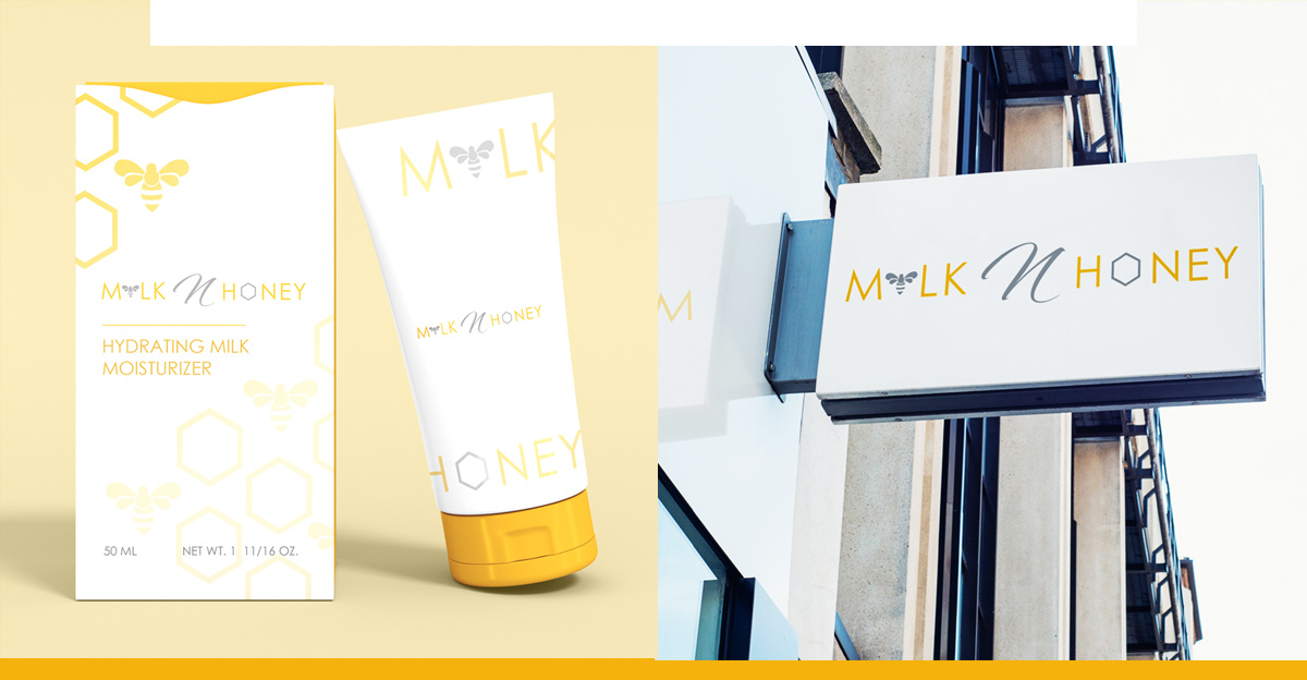
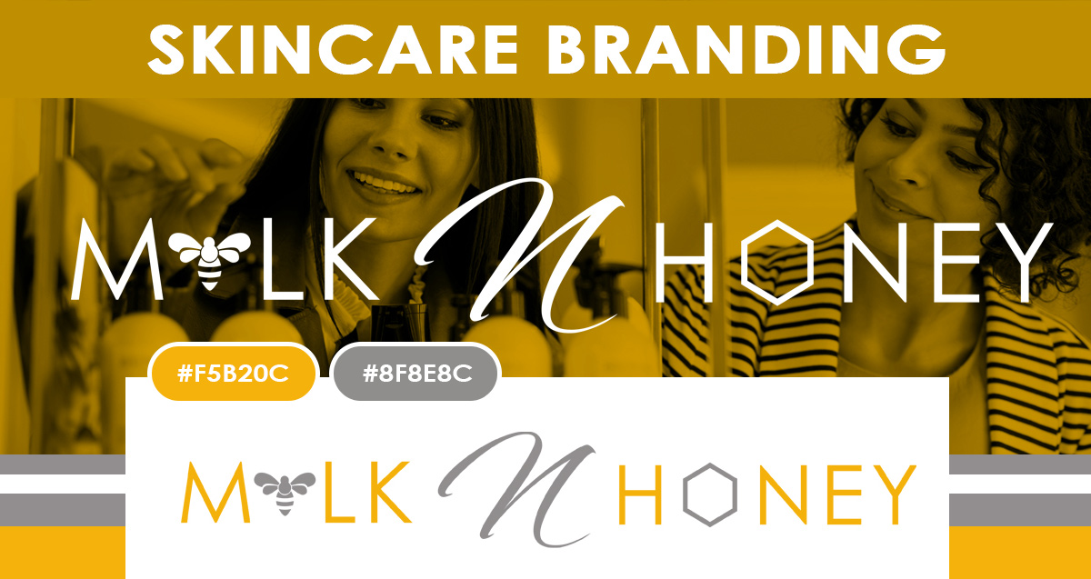
I recently designed branding for a honey-based skincare line. We used soft yellows with honeycomb patterns and clean minimalist layouts. Why? Because health-conscious consumers associate these elements with purity, natural ingredients, and transparency. The brand communicated "clean wellness" before a single word was read.
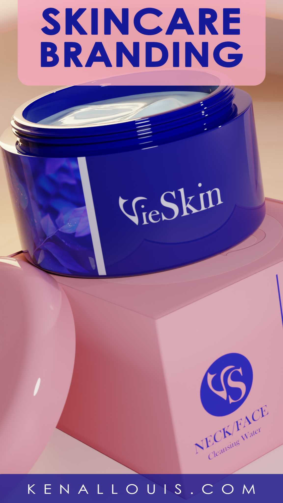
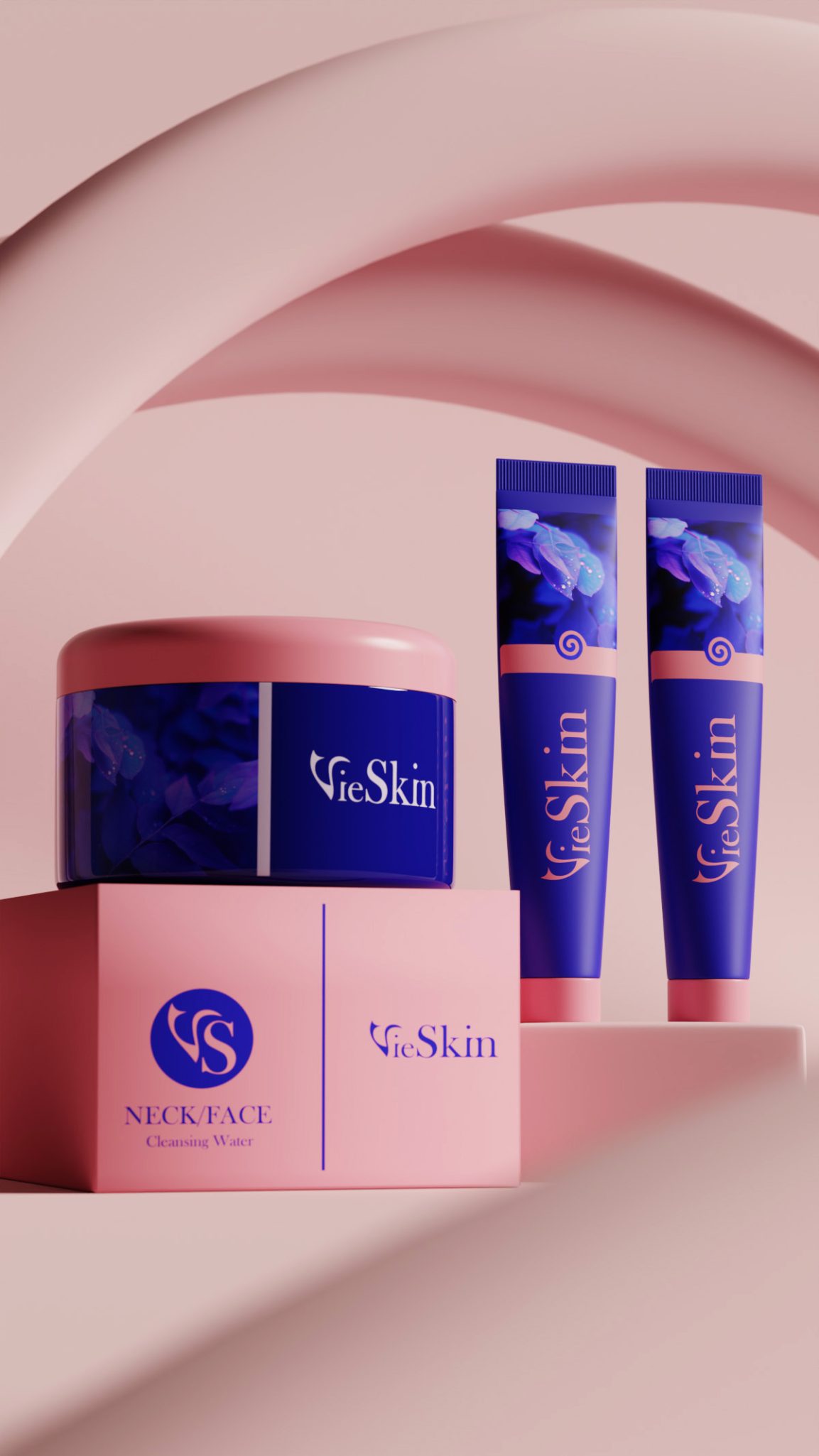
Contrast that with another project using bold blues and nature-inspired imagery. This targeted women seeking science-backed natural solutions. The vibrant packaging suggested efficacy without pharmaceutical coldness. Both approaches worked because they understood their specific health-conscious audience.
Furthermore, wellness-focused women want to feel the health benefits through design. Your packaging should visually represent the transformation they're seeking—whether that's glowing skin, balanced complexion, or age-defying results.
What Branding Elements Health-Conscious Women Actually Notice
These consumers look for specific visual signals that align with their values:
Clean, uncluttered layouts communicate purity.
Minimal designs suggest you have nothing to hide. A client came to me frustrated that her organic line wasn't selling despite quality ingredients. Her packaging was busy and chaotic. We simplified everything, and sales jumped because the design finally matched the product promise.
Natural color palettes build instant trust.
Earth tones, soft pastels, botanical greens, and honey golds signal natural ingredients. However, overly saturated colors can trigger concerns about artificial additives.
Transparent design elements matter enormously.
Clear windows showing the product, honest typography, and straightforward layouts communicate the transparency health-conscious women demand.
Quality material choices speak volumes.
Recyclable packaging, sustainable materials, and thoughtful finishes show you share their environmental values. This isn't just eco-friendly—it's trust-building.
Readable, honest typography is non-negotiable.
Health-conscious consumers want to read every detail. Therefore, your font choices must prioritize legibility over trendy aesthetics.
How to Position Your Skincare Brand for Health-Conscious Women
Start by defining your wellness positioning clearly.
Are you science-backed natural? Holistic botanical? Clean clinical? Your visual identity must reflect this precisely.
Choose colors that communicate ingredient integrity.
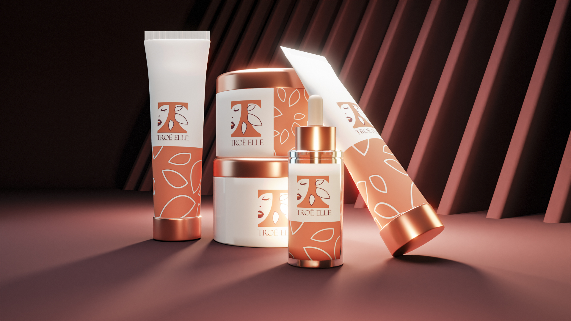
Soft yellows and golds work beautifully for honey or vitamin-rich formulations. Greens signal botanical ingredients. Blues suggest hydration and purity. Choose strategically based on your formulation story.
Design with ingredient transparency in mind.
Make ingredient lists easy to find and read. Use clear hierarchy so health-conscious shoppers can quickly identify what matters to them.
Show, don't just tell, your natural credentials.
Botanical illustrations, ingredient photography, and nature-inspired patterns reinforce your natural positioning more effectively than just claiming it.
Build consistency across every touchpoint.
From your packaging to your website to your social presence, maintain visual coherence. Health-conscious women notice inconsistencies and interpret them as red flags.
Final Thoughts
Health-conscious women are the most discerning beauty consumers, and that's exactly why they're worth designing for. When your branding authentically represents your wellness values, you build trust that transcends trends.
Your visual identity isn't decoration—it's a promise. It communicates your commitment to their health, your ingredient integrity, and your understanding of their values.
Ready to create skincare branding that resonates with health-conscious women?
I'm accepting a limited number of branding projects focused on wellness positioning this quarter. Book a discovery call with me and let's build a brand that health-conscious consumers trust instinctively. Your wellness-focused audience is waiting.
What Past Clients Have to Say About Working With Me
Tags: skincare packaging design, beauty brand identity, cosmetic branding, luxury skincare design, product packaging for skincare, beauty product branding, skincare logo design, cosmetic label design, premium beauty packaging, skincare brand strategy, beauty brand development, skincare visual identity, cosmetic package design, beauty branding agency, skincare product design