
No products in the cart.
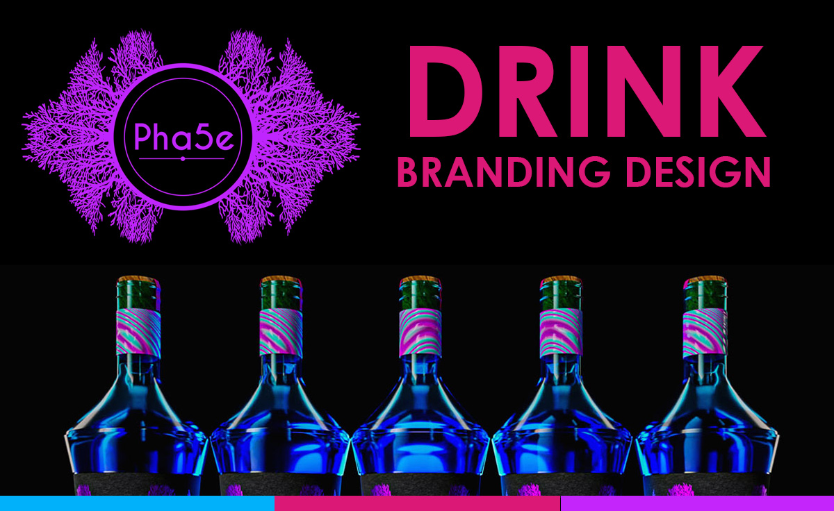
Creative Drink Branding That Speaks Luxury Without a Single Word
Pick up a bottle of Dom Pérignon and cover the name. You still know exactly what you're holding, don't you?
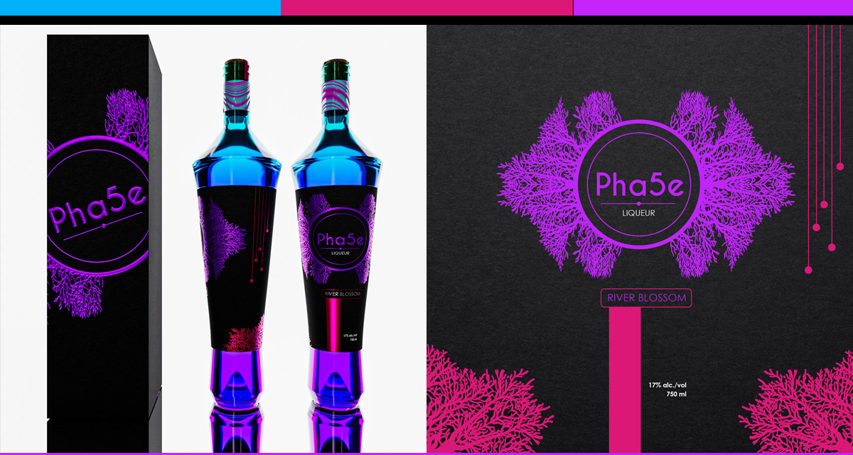
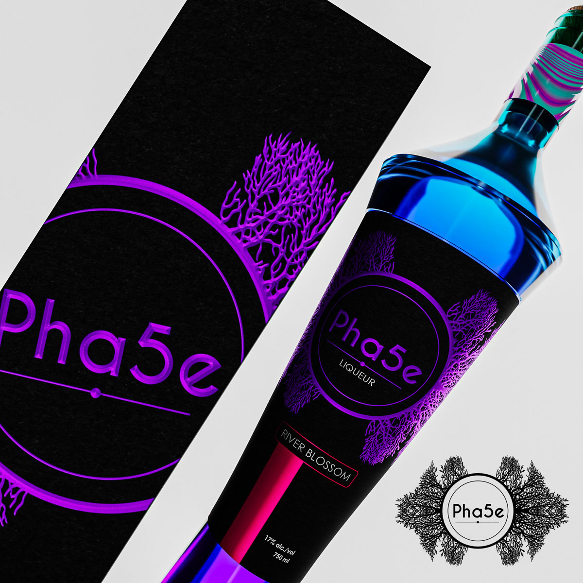
That's because truly creative drink branding transcends language. It communicates through shape, color, and feeling. A cosmetics entrepreneur turned beverage creator came to me with this exact challenge. She wanted her new botanical spirits to feel luxurious to customers in Tokyo, London, and Mexico City simultaneously. No words needed.
Why This Design Example is Awesome
Visual luxury speaks a universal language that words can't match. When branding communicates without text, it reaches the emotional brain directly.
Consider how champagne bottles signal celebration just through their shape. Or how matte black packaging instantly suggests premium quality. These visual cues work across cultures, ages, and languages because they tap into shared human psychology.
The most powerful brands in the drink industry barely need their names anymore. Their visual identity carries the entire conversation. That's the level of recognition every beverage brand should aspire to reach.
What Does It Take
Creating speechless luxury requires these visual elements:
- Iconic Silhouettes – Bottle shapes that identify your brand from across a crowded bar
- Signature Color Systems – Combinations so unique they become synonymous with your brand
- Textural Contrasts – Mixing matte and gloss, smooth and rough, heavy and light
- Geometric Patterns – Abstract designs that suggest quality through complexity or simplicity
- Material Innovation – Unexpected substrates that surprise and delight the hands
- Proportion Mastery – Using golden ratios and visual balance to create instinctive appeal
- Negative Space – What you don't show often speaks louder than what you do
Step-by-Step Instructions
Begin with sensory mapping. What should someone feel when they see your bottle from 10 feet away? Power? Serenity? Excitement? This emotion becomes your north star.
Study universal symbols of luxury across cultures. Certain shapes, patterns, and proportions consistently signal premium quality worldwide. Build your visual vocabulary from these timeless elements.
Develop a signature color story that's ownable. Not just "gold" but a specific shade that becomes yours. Tiffany owns a blue. Hermès owns an orange. What will you own?
Focus on the silhouette first. If your bottle was just a black shadow, would it still be recognizable? The best drink brands pass this test easily.
Layer in textural elements that invite touch. Humans judge quality through their fingertips as much as their eyes. Make your packaging a tactile experience.
Strip away every unnecessary element. Then strip away more. Luxury confidence means not needing to oversell.
Common Mistakes to Avoid
Relying on literal imagery to communicate quality. Pictures of vineyards or distilleries are expected. Abstract excellence is memorable.
Using universal "luxury" symbols without owning them. Every brand can add gold accents. What makes yours different?
Forgetting that different cultures read visual cues differently. Red means luck in China but danger in the West. Research your markets.
Creating complexity for complexity's sake. Sometimes the most luxurious thing is perfect simplicity executed flawlessly.
Alternatives & Substitutions
Can't afford custom glass molds? Work with standard bottles but create revolutionary label shapes. Die-cuts and unusual orientations can transform common bottles.
No budget for metallic inks? Use clever contrast instead. Deep matte blacks against bright whites can feel more luxurious than gold.
Limited to simple printing? Make minimalism your strength. One perfect color used brilliantly beats five colors used poorly.
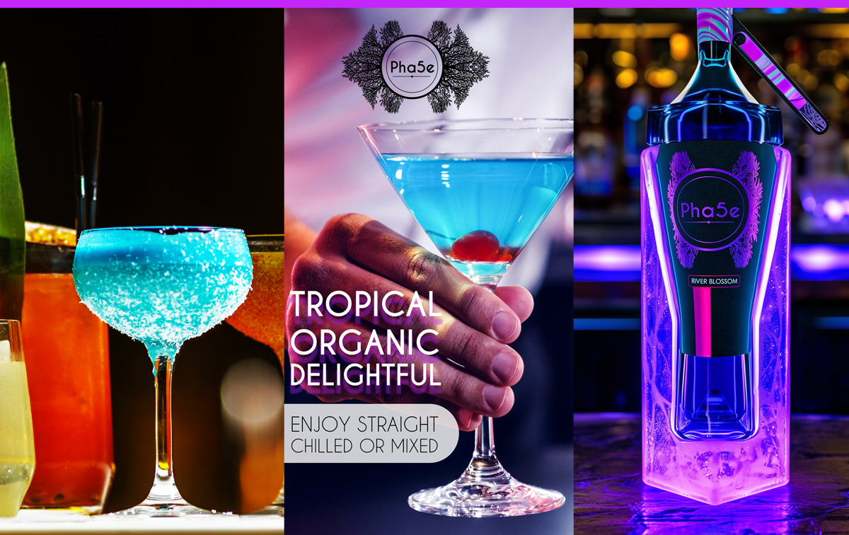
Skip traditional luxury entirely and define your own. Who says luxury can't be neon pink or electric blue if you own it completely?
FAQ (Frequently Asked Questions)
How do I know if my visual branding is working?
Show your bottle to someone for three seconds, then ask them to describe the price range and occasion. If they nail it, you've succeeded.
Can visual luxury work for everyday drinks?
Absolutely! LaCroix turned sparkling water into a lifestyle statement through visual branding alone. Everyday products can feel special too.
What if my target market prefers lots of information?
Even information-seekers respond to visual hierarchy. Make the emotional visual impact first, then layer in details for those who want them.
Should I test across different cultures?
If you plan to sell internationally, yes! What feels premium in Miami might feel dated in Milan. Cultural testing prevents expensive mistakes.
How much should visual branding influence my formula?
Ideally, they develop together. A clear liquid shows differently than an opaque one. Consider how your liquid becomes part of the visual story.
What Past Clients Have to Say About Working With Me
Final Thoughts
Your drink could speak volumes without uttering a word. The most magnetic brands communicate through pure visual emotion.
When someone sees your bottle, they should feel something before they read anything. Now what are you waiting on to take your branding to the next level?
Ready to create visual poetry? Let's talk about your vision.
Tags: visual beverage branding, wordless brand communication, luxury visual identity, creative drinks packaging, non-verbal branding, visual storytelling, bottle shape design, color psychology beverages, drinks branding design, tactile packaging design, sensory branding, premium visual cues, international beverage branding, cross-cultural design, minimalist drink branding, geometric bottle design, texture in packaging, cool branding ideas, beverage branding design, iconic bottle silhouettes