
No products in the cart.
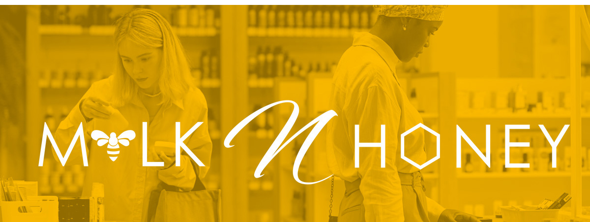
Visual Elements That Shape Your Brand Identity in Skincare Branding
Ever wonder why some skincare brands stick in your mind while others just... disappear? It's not magic—it's strategic visual design at work.
I've spent years crafting brand identities for beauty businesses, and I can tell you this: the difference between a brand that thrives and one that struggles often comes down to understanding visual elements. Your brand identity isn't just a pretty logo—it's a complete visual language that speaks to your customers before you say a word.
Let me walk you through the essential visual elements that transform ordinary skincare products into memorable brands.
Why Visual Elements in Skincare Branding Are Absolutely Game-Changing
Here's something most entrepreneurs miss: your visual identity does the heavy lifting in building trust. In the skincare industry, where customers are putting products on their skin, trust is everything.
Think about it. When someone's browsing the beauty aisle or scrolling online, they make split-second judgments. Your visual elements—color, typography, imagery, shapes—all work together to communicate quality, safety, and effectiveness instantly.
Color alone can increase brand recognition by up to 80%. The right typography communicates whether you're clinical and precise or natural and gentle. Even the shapes you choose—rounded versus angular—trigger subconscious responses about your brand personality.
What makes visual branding so powerful is consistency. When every element works in harmony, you create a cohesive experience that builds recognition. A client reached out to me last year frustrated because her sales were flat. Her products were excellent, but her visual identity was all over the place. After we created a unified visual system, her brand recognition tripled within months.
What Does It Take to Build a Complete Visual Brand System
Creating a professional skincare brand identity requires these core visual elements:
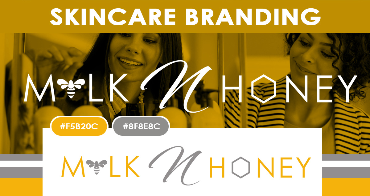
- Color Palette – Strategic color choices that evoke specific emotions and differentiate you from competitors
- Typography System – A hierarchy of fonts that ensures readability while expressing brand personality
- Logo & Brand Mark – A distinctive symbol that works across all applications and sizes
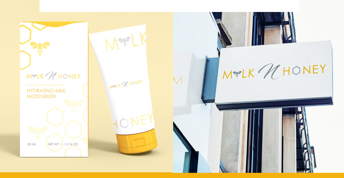
- Imagery Style – Consistent photography and illustration approaches that reinforce your message
- Patterns & Textures – Supporting visual elements that add depth without overwhelming
- Icon Set – Simple graphics for ingredients, benefits, or usage instructions
- Spacing & Layout Grid – Rules for how elements are arranged to create visual rhythm
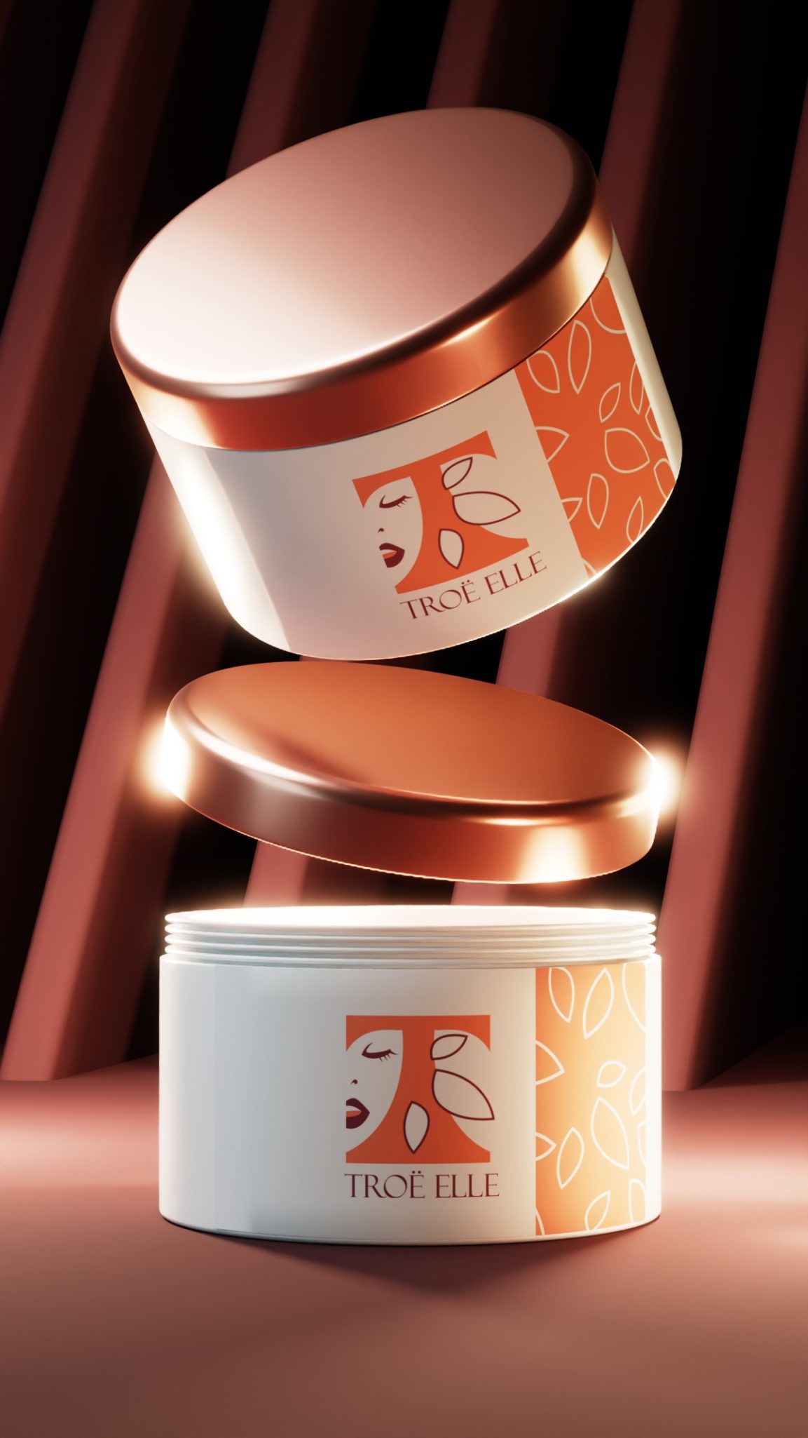
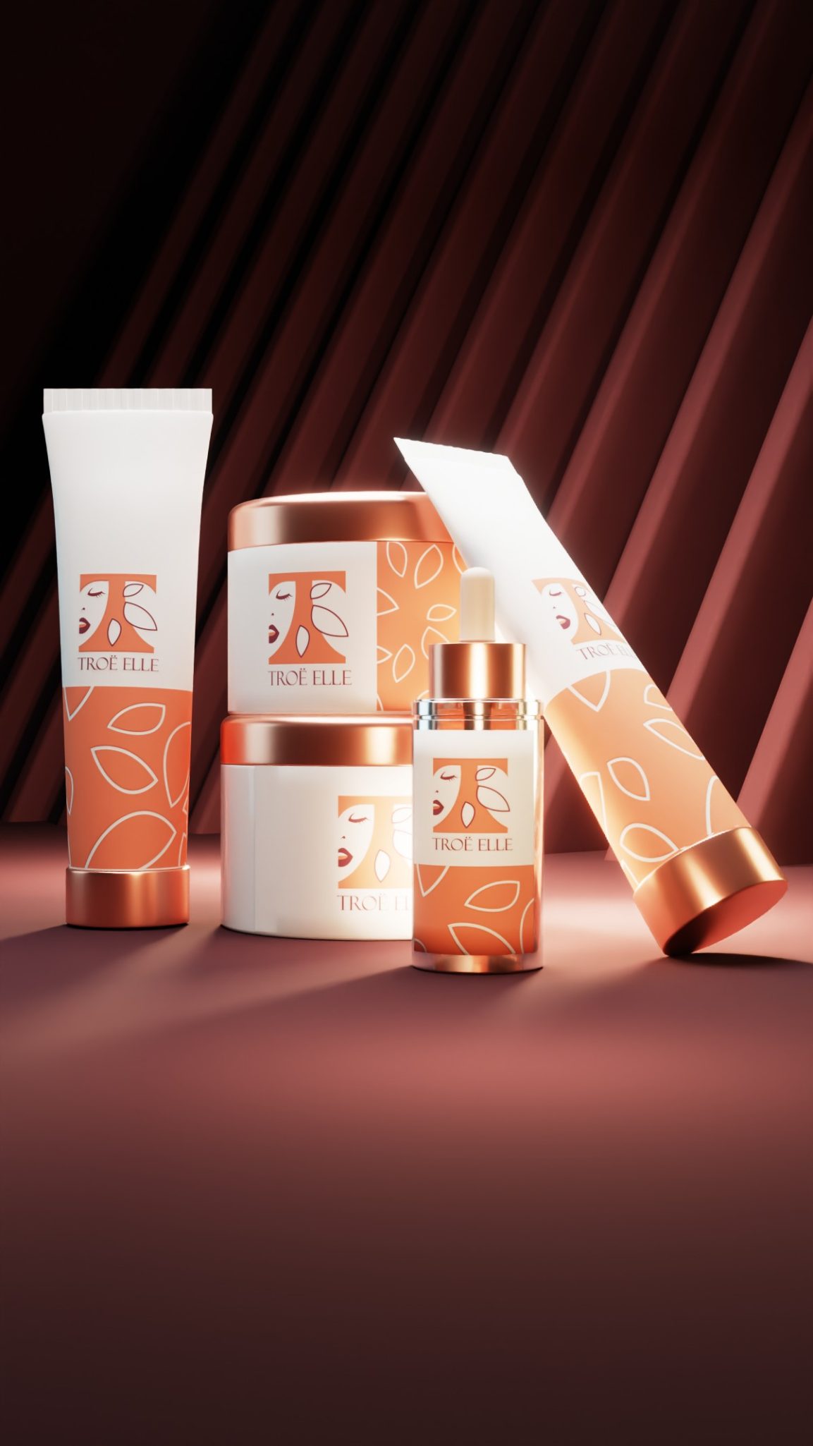
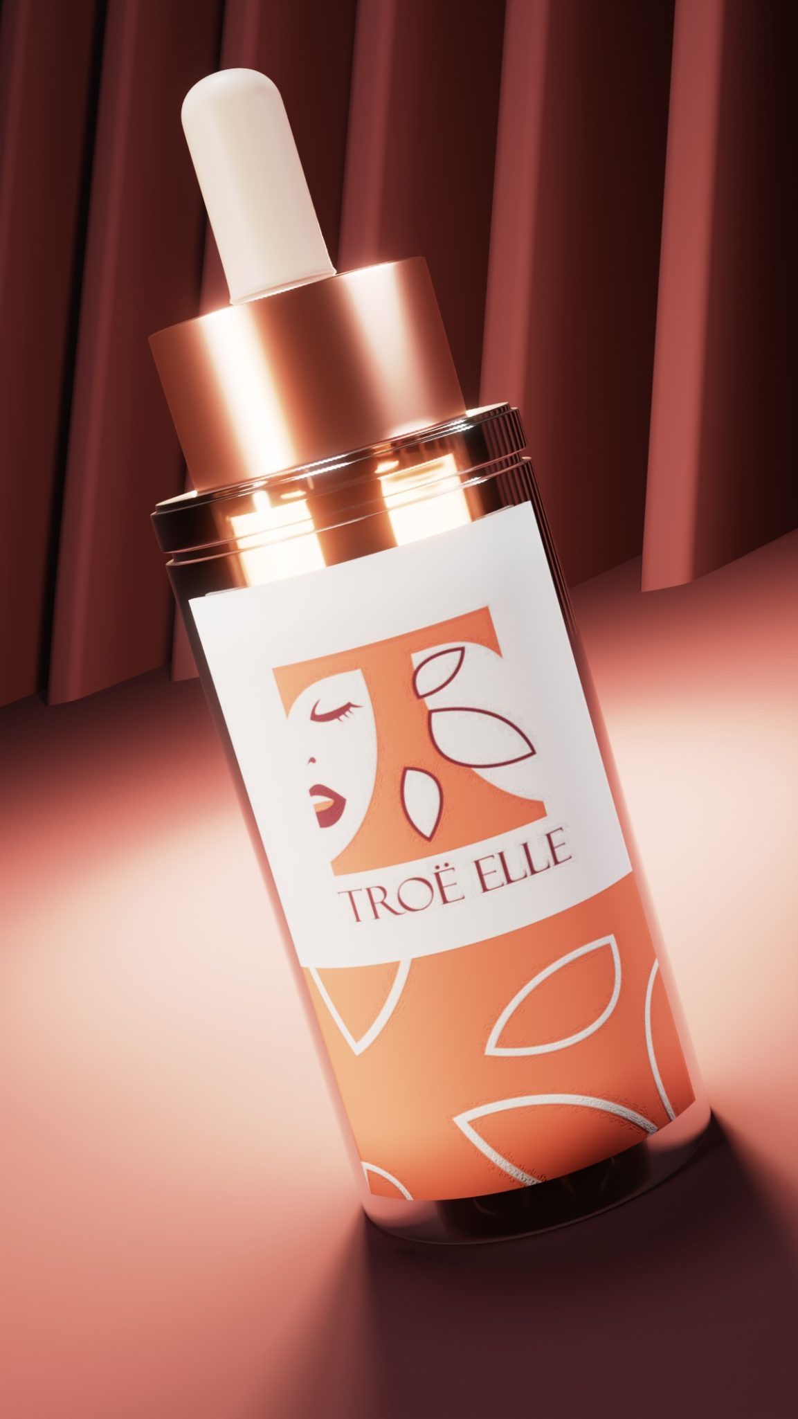
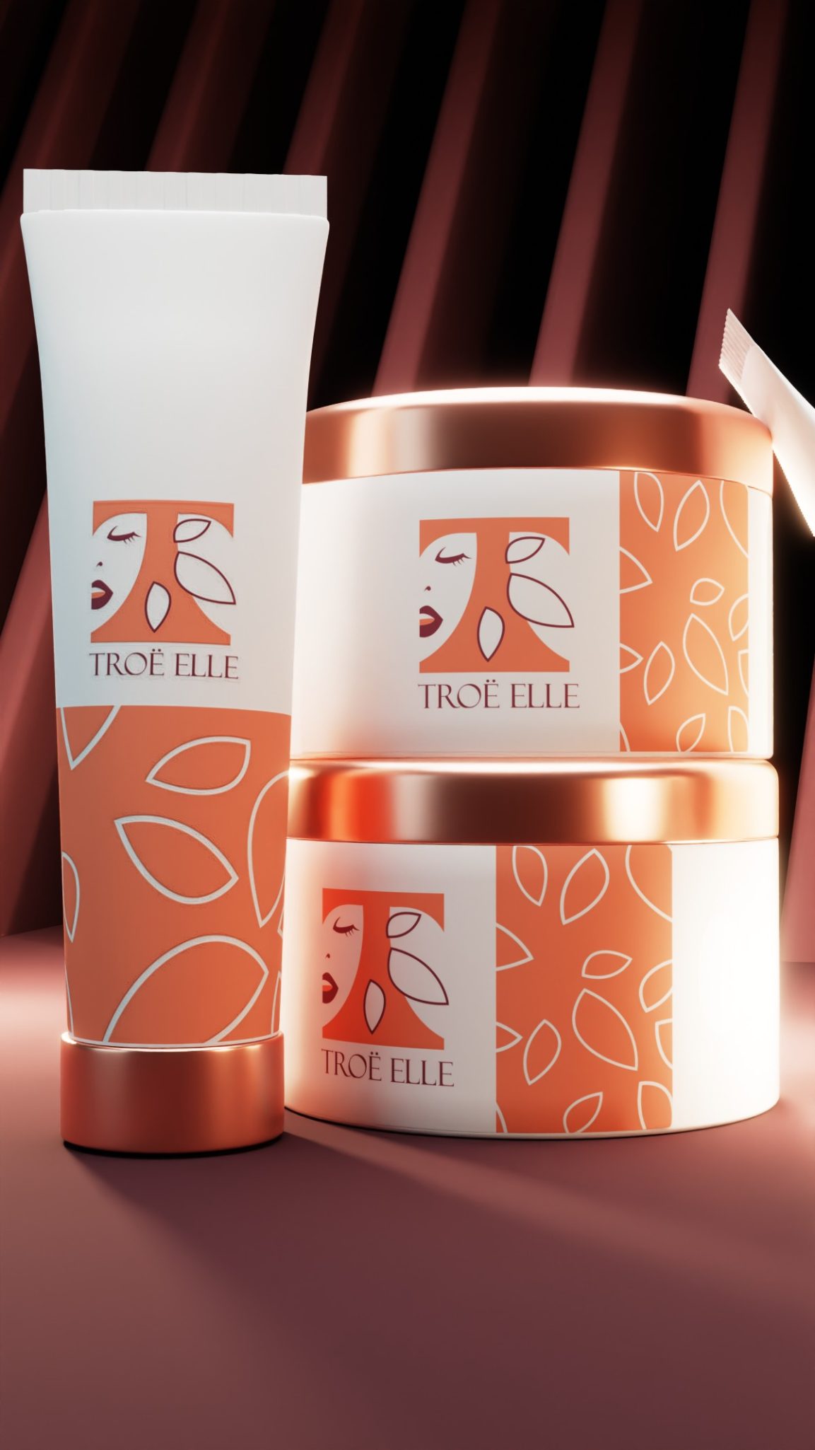
- Finish & Materials – Tactile elements like matte, gloss, embossing that enhance perceived value
Alternative Approaches to Visual Branding in Skincare
Not every skincare brand needs the same visual treatment. Here's how different approaches work for different markets.
For clinical skincare brands, minimalist visuals work best. Think clean whites, precise typography, and scientific imagery. The visual language should communicate efficacy and research-backed formulations.
Natural and organic lines benefit from earth tones, botanical illustrations, and texture-rich materials. However, avoid the dated "health food store" look—modern natural branding can be sophisticated and premium.
Luxury skincare demands refined visual elements: metallic accents, elegant serif typography, and premium finishes. Every detail should whisper exclusivity and indulgence.
Budget-conscious brands can still create strong visual identities by focusing resources strategically. Invest in excellent core elements—logo, color palette, typography—and keep applications simple but consistent.
Honestly, I believe the best approach is one that's authentic to your brand promise. Don't try to look luxury if you're selling affordable basics. Your visual elements should honestly represent what you deliver.
Final Thoughts
Visual elements aren't just decoration—they're strategic business tools that build recognition, communicate value, and create emotional connections with your customers.
When you invest in developing strong visual brand elements, you're not just making things pretty. You're building equity in your business. Every consistent touchpoint reinforces who you are and why customers should trust you.
The skincare market is crowded, but thoughtful visual branding cuts through the noise. It transforms browsers into buyers and first-time customers into loyal advocates.
Ready to create visual brand elements that make your skincare line unforgettable? I'm currently accepting a limited number of branding projects this quarter. Book a discovery call with me and let's build a visual identity that positions your brand for success. Your vision deserves professional execution.
What Past Clients Have to Say About Working With Me
Tags: visual brand identity, skincare brand elements, beauty brand visuals, cosmetic brand design, visual brand system, brand identity design, skincare packaging visuals, beauty brand aesthetics, cosmetic visual identity, brand color psychology, skincare typography, beauty brand patterns, cosmetic brand textures, visual brand consistency, skincare logo design, beauty brand recognition, cosmetic brand differentiation, visual brand strategy, skincare brand guidelines